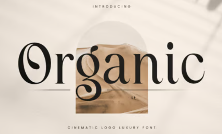
Why You Need to Use Organic Fonts in Your Design Projects

In a digital world dominated by sterile, geometric typefaces, organic fonts bring a refreshing and human-centered touch to modern design. With their hand-crafted feel, irregular contours, and natural flow, organic fonts break away from mechanical perfection. These typefaces echo the textures of handwriting, brush strokes, ink bleeds, and even nature itself—making them incredibly versatile and emotionally resonant. Whether you’re designing a brand identity, packaging, a website, or social media content, using organic fonts can add authenticity, warmth, and uniqueness to your work.
What Are Organic Fonts?
Organic fonts are typefaces designed to mimic the imperfections and fluidity of naturally made forms. Instead of following rigid geometric rules, they often include irregular letter shapes, soft edges, and dynamic line weights. Many are inspired by hand lettering, calligraphy, or natural patterns. The goal is to evoke a feeling of humanity and character—qualities that can sometimes be lost in overly polished digital design.
They come in various styles, from soft serif fonts with earthy curves to playful hand-drawn scripts and flowing brush fonts. Despite their variety, all organic fonts share one thing in common: they feel personal and alive. That emotional dimension is why they’re growing in popularity across branding, editorial, and digital platforms.
Why Designers Are Turning to Organic Fonts
The demand for more emotional and relatable design has led many creatives to turn to organic fonts. These typefaces help connect with audiences on a deeper level, especially in industries that value authenticity—like food, wellness, fashion, crafts, and sustainable living. A font that looks like it was written by hand can help a brand appear more approachable and honest. For instance, many organic food brands use handwritten or nature-inspired fonts to reinforce their messaging of purity and transparency.
Beyond emotional impact, organic fonts help break visual monotony. In a world flooded with minimalist sans-serifs and clean lines, an organic font immediately stands out. It creates visual interest, adds texture, and communicates creativity. These traits are especially valuable in logos, packaging, headers, and other places where you want to grab attention quickly.
See also: Navigating Complex Regulations with AI: How Modern Tech is Reshaping Compliance
Best Practices for Using Organic Fonts
To make the most of organic fonts, it’s important to use them intentionally. Because of their distinctive appearance, they often work best in headlines, logos, and focal text rather than body copy. Pairing them with a clean, neutral sans serif can create a strong contrast and improve readability.
Choose fonts that match the tone of your content. A playful, bouncy handwritten font may be ideal for a children’s brand or craft shop, while a more refined organic serif could suit a boutique or eco-conscious fashion brand. Pay attention to the spacing and scaling, as organic fonts can be irregular and may require manual adjustments to achieve a polished result.
Conclusion
In a time when people crave authenticity, connection, and individuality, organic fonts offer a powerful way to communicate visually. They bring warmth to sterile interfaces, uniqueness to mass-produced content, and soul to every project. Whether you’re aiming for elegance, playfulness, or earthy simplicity, incorporating organic fonts can transform your design into something memorable and human. In short, organic fonts don’t just say what you want—they say it with feeling.


